Saturday 18 April 2015
Friday 17 April 2015
Monday 6 April 2015
Question Three: Part One/Two
I created a Instagram page for the artist so that they can build up an audience. I particularly picked Instagram as apposed to any other social networking site or application as Instagram is known for receiving heavy traffic as it is relatively a new application as in comparison to other applications and social networking sites.
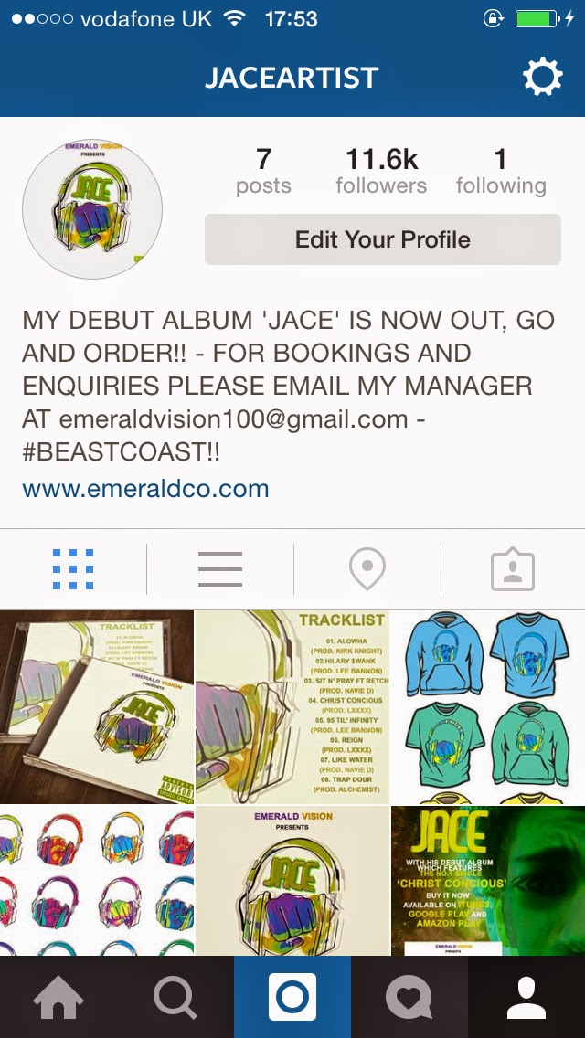
This is the page that I created for the artist. I included a lot of information in the section which is called the 'Bio' section. I stated that the album was available, the website of the music company and the email address for any bookings and enquiries.
The email is very vital in building up an audience because if Clubs or event companies or festivals would like to include them to the event, this allows people who are not familiar with the artist to get familiar with their music. I also added images of the album and posters of the artist. It is also a way to get feedback from the audience on the ancillary text and the main product. This can be viewed from the comment section where people place their opinions on what is uploaded.
 Survey
Survey
I used a survey creator to gain feedback from my audience on what they think about the music video that I had created. When thinking about what questions I should feature on the survey, I had to make sure that the questions where closely related to the conventions of the music video and wether they are linked to the hip-hop genre. I used survey monkey.com as it offers a user friendly platform which makes it incredibly easy to create surveys and then share them to social networking sites which would allow more people to respond to the questions of a larger scaled. Some of the questions that where included are:
- What genre of music do you think this music video belongs to and why?
- What intrigued you about this music video
- What led you to watch the music video
- After Watching the music video, what do you think could be improved?
- What do you think worked well in the Video?
Saturday 4 April 2015
Evaluation Question One
In what ways does your media product use, develop or challenge forms and conventions of real media products?


The use of branding and affiliation is very key in hip-hop music videos. In all of hip-hop branding is probably one of the most fundamental things as it sets the artists trend and image. For example, the image to the left shows one of the artists from a hip-hop group called 'Rae Sremmurd' is wearing a t-shirt that has the groups logo on it. The reason I chose this as an example is because the screenshot I used is from a music video that was their debut song. As they grew a bigger audience their logo and image became more individual and recognisable. This example shows how important branding and affiliation is in hip-hop music videos. I have demonstrated this in my hip-hop music video; the logo used in the music video is a brand of skateboarding clothing, which is affiliated with the artists.


The mise-en-scene that I used swell was urbanised which is a direct link to the genre and sub-gene of music that my artist performs in,especially how some of the scenes have symbols and signs which may add meaning to the song (as seen in the right image above). The lighting that I have used also is quiet effect. I decided to use low-key lighting in order to focus the view on the artist but to also add mystery to the rise-en-scene.


The body language of the artist has an effect on the song depending what the song is about, but typically, as hip-hop is a genre of mainly 'hype' music, body language is key in emphasising the lyrical content of the song as seen in the example on the left and in my own hip-hop music video on the right. Most of the time the actions used allow the viewer to notice certain lyrics more which makes the song more memorable. I have clearly demonstrated this in my own piece. However, with this being said, it is not easily done. In the test shots which are on this blog, the body language is very subtle, which was analysed and improved in our actual filming. As the director and filmed of the music video, it is my duty to make sure the artist understands what type of action and body language they should have.

How I Made The Poster

Firstly I cut the artist out from the background using the pen tool by outlining the artist and then converting it into a selection. I then copied and pasted it onto a new layer and named the layer JACE.

I then duplicated the layer twice. On the original layer I changed the colour of the image by using the Hue and Saturation option. I did this with the other layers but changing them to different and contrasting colours.

I then changed the blending mode of all of the layers to multiply. I then changed the position of the duplicated layer and this made a distorted effect which matched the effect which is on the album cover. This carries on the theme from the album cover on to the poster.

I then made a new document and copied and pasted the image of the artist onto the new document. I then increased the scale of the image and then moved half of the face off of the canvas. This makes the artist the main topic of the poster and allows the audience to get familiar with the image of the artist so it becomes more noticeable.

To add bit of finesse on the cut-out of the image of the artist, I applied a gradient on the artist so that the canvas fades into the artist. I did this by applying a layer mask and using the gradient tool to apply the fade.

I then got an image of the galaxy (which was originally purple). To match the colour of the artists image, I used the hue and saturation option to change the colour of the image to a lime/green colour.

I then applied it to the posters canvas as the background to add a nice effect.

Finally I added the information of the album and the artist. Firstly I copied and pasted the artists album to the poster; I made it fairly large as people should be aware that the album is now available and they should be able to recognise the album. I then added the text and used a combination of white and yellow to contrast the colours used in the background and on the artist. I made sure to add the main single of the album which is 'Christ Conscious', I also added the artists logo.
Friday 3 April 2015
T-Shirt & Hoodie Mockups (As Part Of The Digipak)


I decided to add t-shirts and hoodies with the album logo on the front as part of the digipak. Again this is promotion of the artist and allows the audience to grow. Especially as the mock-ups use vibrant and bright colours, this will be able to catch the attention of people who are intrigued by the design; curiosity may potentially add another follower to the fan base which thus increases the audience. The logo then becomes an icon which is directly linked to the artist and easily recognisable anywhere it is placed. The mockup where drawn and the traced on illustrators as vectors in order to get a high quality image. Vectors use computer information as apposed to pixels which is the reason why the quality is much better.
Poster (As Part Of the Digipak)

I wanted to make the album logo (along with another drafted album logo that was created but not featured on the album) as a montage poster in different colours. I want this logo to become the first icon of the artist as this can become very influential as he develops in his career. Furthermore, I think the metaphor and message that the logos present is a clear reflection of the musical content that the artist and the album posses; this will help the audience distinguish the artists style and allow people who are not used to this type of genre appreciate the lyrical content and the message that is presented by the artist.
.jpg)
.jpg)

The Making Of The Album Cover
As posed to having a typical album cover which would include the artist them selves with some typography, I wanted to create an album cover that has a simplistic approach, with simplistic graphics which may convey a complicated meaning.


I started of by getting the dimensions of a typical CD cover. This is essential, as it will be imperative to get the dimensions of the print outs accurate in order to get a high quality print. This will prevent pixels from being stretched and text being "bastardised" (when the original dimensions of the fonts and text are altered) which would distort and reduce the print outs quality. I then typed in the dimensions into Photoshop to create the correct sized canvas.
From the montage of logos I made earlier in the project, I picked the logo that I thought had the most vibrant combination of colours which was the first logo that was created.
I then placed the logo in the middle of the canvas and duplicated the layer twice. With the duplicated layers I wanted to create a distorted effect, almost like a 'dizzy' effect. I did this by lowering both of the duplicated layers opacity and setting the blending mode to multiply. This means that the pixels will essentially 'pass through' each other. I then moved each on to either side and this gave the effect that the logo was moving side to side. People may denote from this alone, that the music on this album will 'rock you head' because of the lyrical content, this is also emphasised by the logo itself which features a fist that has headphones wrapped onto it. This essentially creates a meaningful metaphor. This was the type of simplistic approach that I wanted and I believe that this alone will catch people attention if they were to be scrolling through albums on iTunes or if they happened to pass by it in a music store.
I then added the artists logo to the album cover so people actually know who the artist is. I got the font from my previous font type research I did in this project. I picked this one because the font also has a similar 'dizziness' effect that I have applied to the main album covers logo. I think this works well together. I then duplicated the layer three times and changed the colours to similar colours which are found on the fist logo. I basically did the same thing to the artists logo as I did to the fist logo. I decided that the album will just be called 'JACE' as it is his debut album I would like people to get to the artist himself more.
I then added a stroke to the original layer to add stability to the colours. I then merged the text layers together so that I could alter the hue of the all the layers to match the colours of the fist layer, as the effect had changed the colours slightly to darker colours.
Finally I add the production company which is Emerald Visions and the parental advisory logo for parental reasons (to notify parents that the content of the music may include swear words and themes which may not be suitable for minors).
For the track list page, I wanted to carry on the theme of the fist, so I placed it on to the canvas (same sized canvas) and enlarged it so that the logo was partially visible.
I then added the track list with all the tracks which will be featured on the album and also kept the matching and dominant colours.
Tuesday 24 February 2015
Editing The Third Draft!
I wasn't quite satisfied with the second drafts effect and thought they were quite mediocre. I also thought i could've added much more on beat editing so I decided to re-edit the whole video starting from scratch! Now I know that some of you would think that this would be repeating a very long process for the second time, however, after completing the first draft I was able to get a grip of the program and learnt more shortcuts and tricks! This time however I made sure that I did everything methodically as i knew that this would help my editing more organised. So what I did first was lay out all the footage on the time line and made sure that the lip synching was on point on all of the footage. I then played the whole song and set all the markers using the shortcut 'M'. I also added some flicker effects which are more towards the end, however, as this involves more cutting I had to do this manually with the blade. I then rendered it and this is what I got.
Now the quality of the footage is good (considering it was filmed in 1080p/720p) however, due to the editing it did lose some of its quality and saturation. So what I intended to do next is correct the colours, hue and saturation. I also wanted to add an anamorphic frame onto the footage. Now for those of you who don't know what an anamorphic view is, its basically the twi blocks you see at the bottom and top of a movie. There is no real technical reason why this is used however it is used as it gives 'scope' to the footage which somehow increases the quality of the footage.

This screenshot shows how I used the curved and solids to edit the footage. also, as you can see from the screenshot I am using After effects. Firstly I inserted the footage into the timeline. I then added an adjustment layer, which is where the quality of the footage will be controlled from. I then chose the curves setting which brought up the RBG curves panel. From here i can mix all the reds, blues and greens of the footage. This is cheaper way of enhancing the quality of the footage without having to buy plugins for £100 or more! If done correctly, you will get excellent results.
After I was done with the curves, I then started with the anamorphic view. I did this by creating two new solids; One that was 1920x1080 and one that was 1920x817. I then put two rectangle masks over the HD view which is what left the two blocks only visible and that was basically it. Next the final things which i will be adding to the music video is the filming logo, artist logo and artist promo.
Monday 23 February 2015
Sunday 22 February 2015
Making Of The Second Draft!
In the second draft, I intended to add some distortion to the music video, to give a sense of mystery; then the idea of a TV warp came to mind. So it was time to go onto After Effects :)! After Effects is very useful in making high standard effects as multiple plugins are released from different developers excluding Adobe.


What i first did was import the first draft into the composition. I then added an adjustment layer which is what I actually add the effect to and which is where the effects functions from. I then shortened the adjustment layer so the effect only function where it pasts a section of the adjustment layer. In order to gain more accuracy I lowered the timecode into frames as seen in the screen shot above the time lap.
This is how the effect looks when it is in function. Settings can be altered and manipulated on the side panel; for example, the wave warp, wave speed and noise. This can determine how strong the distortion can be however, I picked a low amount for each setting in order to get a moderate effect in terms of strength.
I added some turbulance to add some added distortion to the image. The turbulance was a different plugin which was already on the presets when you buy After Effects. Again, the setting can be manipulated to your preferences.
This is how the whole composition looked when I was finished adding the effect to sections of the video. I tried not to over use it and use it in relevant places which would be memorable. I then rendered it, which took me quite a long time to render on my mac even with the minimal amount of effect i used due to the low amount of RAM.
Saturday 21 February 2015
Making The First Draft!
For the first draft, i decided to use Final Cut Pro X! It was my first time using the program, however, it is not quite as complex and sophisticated as After Effects or Premiere Pro; however, it is suitable for the first draft as i will be simply mixing the footage together and doing some on beat editing, so the simple functionality should make it fairly quick for me to edit. We will get to the nitty gritty editing later!


Firstly I imported all the footage I needed into the panel before I started any editing. Final Cut Pro X is good for this type of editing as it allows you to add sections of the footage if you do not intend to add all of the footage. However, as it was my first time using Final Cut, I added all the footage. Once I added the footage, i then added the track in a MP3 file format (which is easily recognisable by any video editing software). So this saves me time, I then made sure I made the Lip Synching on point. I did this by muting the sound coming from the track and then increased the volume of the actual footage to see when the track started in the footage so i could match it with the actual MP3 track. I then cut the footage which was not needed. I did this to every piece of footage.
I then started the on beat editing. Theres a specific function which helps a lot in Final Cut Pro which is known as the Marker tool. It was really down to my sense of beat to mark out when the beat dropped. It was made easier by using the shortcut which is simply the key "M" on the keyboard to mark out the beat every time it dropped as the footage/track played. Once you set the markers, the will show with small blue mark points.
I then used the Blade tool (shortcut "B") to cut the footage on the markers that i set which would allow me to cut any footage i would wanna replace with any other section of footage that I wanted to use. Again, this would've taken me much more time if I did this process with each an every footage track individually as i would have to match the lip synching every single time I cut a piece of footage. This is what it looked like when I cut some of the footage out (a lot of beat markers -_-" thank god for shortcuts!).
Once I was finished I then rendered the footage to the correct settings! Draft One Finito :)!
Organisation Of Footage

It is very important to have your footage organised and numbered like the screenshot shows. This saves a lot of time as you wont have to continuosly watch each individual video to check what the footage is; normally it will show a frame of it (it doesn't show it on mine because my macbook decided to be slow -_-")
Saturday 31 January 2015
"JACE" Artist Logo Design Drafts
I have decided that the artists name will be "JACE". I came up with this name as the artists real name is Joseph and i wanted to mix the name Joseph with the word Ace so i came up with Jace. These are the drafts for the artists logo. I will shortlist it until i get one final font. All the fonts where provided by dafont.com I do not own the logo designs what so ever. I wanted to use fonts which looks like graffiti and urban art to push the urban theme.

Font: MARSNEVENEKSK

Font: Inner City

Font: DCC - Scisor

Font: Culdesac

Font: Dystopia

Font: Lazy Sans

Font: Cracked

Font: Vademecum
Subscribe to:
Posts (Atom)